Buildings can support health by integrating exercise into our daily routine of walking around a building. Taking the stairs instead of the elevator, for instance, can be particularly important if you sit at a desk working all day. The Interior Fitness Circulation Feature of the WELL Building Standard sets design guidelines for promoting stair use and walking.
While studying for the WELL exam, I gave myself an exercise to write about 3 buildings to illustrate some of those strategies. I learned the following:
- If you are studying for the WELL exam, thinking about real-life examples of specific Features can help you learn the material and also makes the learning more fun than rote memorization.
- Once you start applying the recommendations of a Feature to real buildings, you realize that certain designs can potentially satisfy the intent of a Feature if not the specific letter.
The three buildings that I discuss pre-date the WELL Building Standard and were not built specifically to satisfy the standard. The old MIT Media Lab building, illustrates a design that does not work so well to promote stair use. The other two, the MIT Medical Building and the new MIT Media Building, provide some nice examples that satisfy most (though not all) of the requirements.
To review, the Interior Fitness Circulation Feature is broken down into 3 parts or strategies:
- Make stairs accessible.
- Promote stair use
- Make stairs aesthetically appealing to encourage use
Here’s the full text of the Interior Fitness Circulation Feature.
One Building that Doesn’t Promote Fitness:
At the old Media Lab Building, built by I.M. Pei in the 1980’s, visitors entering the building first step into a tall 4-story atrium space. While the atrium has some nice features—skylights from above and resonant acoustics that enhance the music from a grand piano in the lower level, the building wasn’t designed to specifically promote fitness. One flight of wider stairs lead to a lower level, but the main stairs that could provide exercise for anyone accessing the upper levels are harder to find.
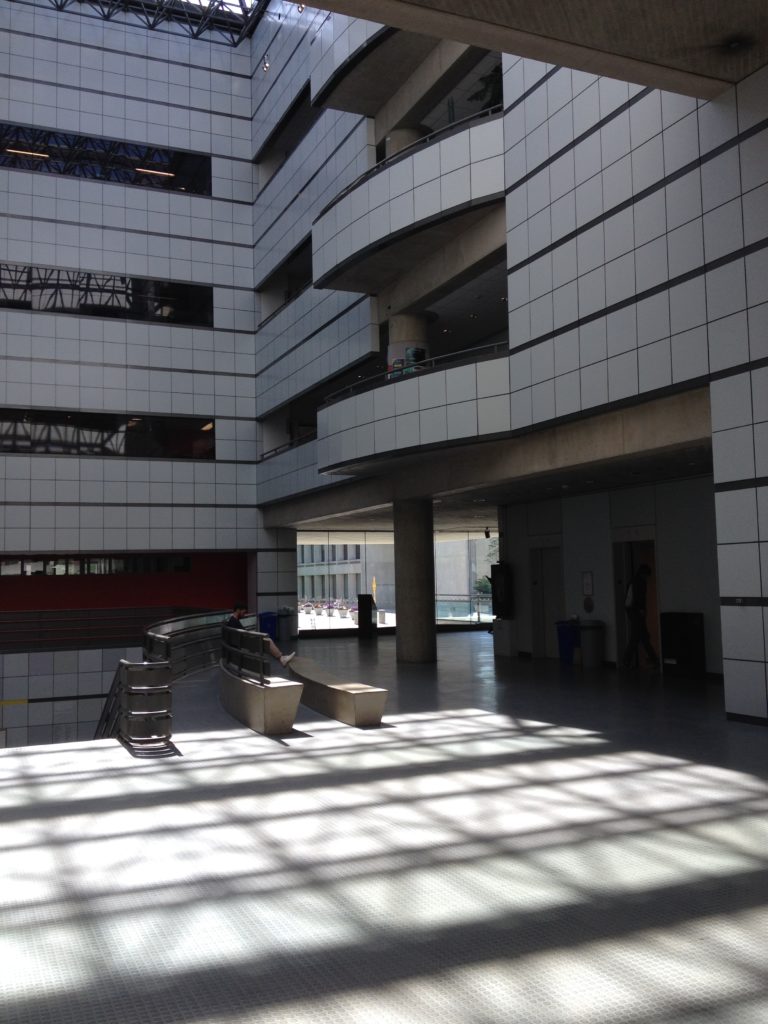
Old MIT Media Lab Atrium / Lobby
The elevators provide the primary means of accessing the upper floors, while the stairs are strangely tucked into a small back hallway, behind the elevators, next to the bathrooms.
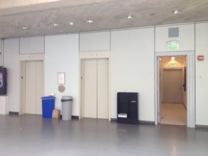
Old MIT Media Lab Lobby Elevators
An egress map by the elevators shows the location of this stairway, but does nothing to highlight their existence or promote their use.
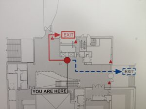
Old MIT Media Lab Lobby Plan
The stairs themselves are a windowless, concrete core stair. While some new lights and brighter paint colors were recently added, the stairwell is nothing to write home about. With a direct exit to the outside at the ground floor, it was probably designed more for egress than to encourage physical activity.
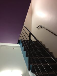
Old Media Lab Stairwell
Two Buildings that Promote Fitness:
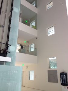
By contrast, at the MIT Health Services Building atrium, a 5-story stair sits next to a heavily-trafficked atrium. The stairs are visible first, while the elevators are tucked to the side in a secondary hallway. A number of aesthetic features help encourage people to take the stair:
- The stair has a fun, triangular shape
- Multistory glass walls and a skylight make atrium feel bright and airy
- The is some artwork (and plants) in the atrium
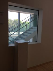
- Interesting round windows frame views of the outdoors from the upper floors
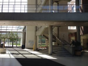
MIT Health Services Building Atrium

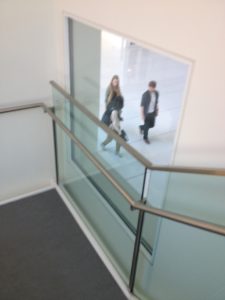
MIT Health Services Building Atrium–View from Above
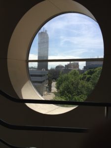
Nice View! MIT Health Services Building Atrium Window
Also, while this is not listed by WELL as an exercise-encouraging aesthetic strategy, the view from the top of the stair of people passing through the atrium is also very nice.
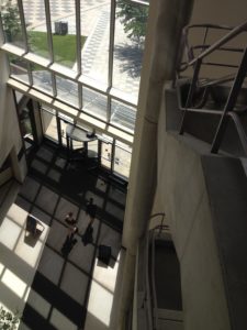
MIT Health Services Building Atrium
Another example, the new Media Lab Building, designed by Fumihiko Maki and opened in 2010, has two sets of stairs that are clearly visible from either of the two main entrances as required by the WELL Standard. One long stair, brightly-painted red, blue and yellow at various flights, winds through main atrium.
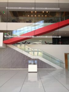
New MIT Media Lab Main Stairs
The other is a white core stair next to the main elevators and along an exterior wall.
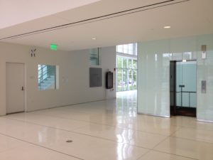
New MIT Media Lab Main Elevators
As you walk up the the winding stair you can peer through all-glass walls into some of the labs and see very interesting work (prototype prosthetic limbs from the Biomechatronics group, or robot actors from the Opera of the Future group).
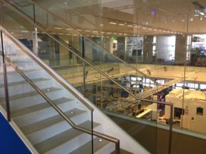
New MIT Media Lab Stairs
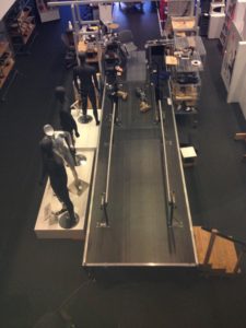
Biomechatronics Lab – Of course, I can’t help but think of the Six Million Dollar Man…
The core stair, which runs from the lobby to the 5th floor, sharply contrasts with the darker, concrete stair at the old Media Lab.

New MIT Media Lab South Stairs
The new stair features a glass exterior wall that provides ample daylight and views of trees, the Charles River and the Boston skyline.
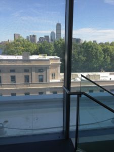
New MIT Media Lab South Stairs
On the interior side wall of stair, small square windows frame views into the building. From the hallway, these windows also promote the stairs; people can also see through to stairwell to the outdoors.
New MIT Media Lab South Stairs
New MIT Media Lab South Stairs
New MIT Media Lab South Stairs
Recommended Improvements:
With these three stairs, one easy improvement to further encourage stair use would be to incorporate “point-of-decision prompts”, or what a former colleague of mine, Stephen Intille, calls “just-in-time” information, to encourage stair use. Intille and one of his former students, Jacob Hyman, installed signs encouraging people to take the stairs instead of the escalator at various subway stops around Boston. They also built a computer vision system to track how well these signs encouraged exercise. Hyman’s thesis (Hyman, 2003) reviews previous studies that have shown that signage can increase stair use by around 8%. Training people to take the stairs seems to last even 2 months after signs are removed.
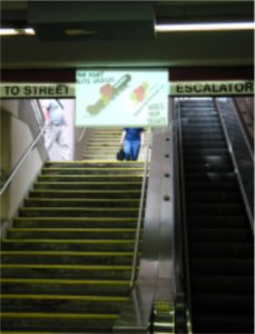
Jacob Hyman’s Stair Experiment

Jacob Hyman’s Stair Experiment
The lesson: signage encouraging exercise works. It can also be a inexpensive health-promoting retrofit for existing buildings.
Commentary on the Standard:
If you are studying for the WELL exam, considering real life examples helps solidify the requirements in your mind.
Once you start to apply the WELL Building Standard, however, you realize that satisfying the intent of the standard can be a lot more nuanced than satisfying the letter. For instance, you could argue that the winding stair of the new Media Lab building satisfies the intent but not necessarily the letter of incorporating art to create visual interest. The stair itself is quite beautiful with its brushed stainless steel hardware and the small tread lights.

Nice Stair Lights!
Likewise, you could argue that the winding stair provides interesting views that could encourage exercise without specifically providing a “view window”, as listed in the Standard. The stair runs up an atrium with open views below of a giant video screen, people playing foosball and the occasional a gallery display. The stair also runs alongside full double height glass walls that display interesting work being done in the labs.
There’s an option to submit “Alternative Adherence Paths,” so perhaps these details could still count to satisfy the requirements of the Feature.
Visiting the Buildings:
If you find yourself in Cambridge, MA and want to see these buildings in person, take a short walk down Carleton St. from the Kendall/MIT subway stop and pass through the atrium at the MIT Health Services Building (between buildings E25 and E23) and cross the plaza to find the old and new MIT Media Lab Buildings (buildings E15 and E14). Here’s a map.
And send me a note. I’d love to connect or hear your thoughts!