Author Archives: tyroneyang

How to Remember All Those Health Statistics

Numbers, numbers, numbers…

For the WELL exam, you’re expected to know a lot of health statistics.  Random strings of digits are hard to remember (think phone numbers—anyone still memorize those?).  Our brains are looking for meaning, structure and order, and numbers typically don’t provide that.  The best way that I found to address this method called the Mnemonic Major System (terrible name).  I’ll summarize this system, but you can also read about this in detail here:

This is helpful.  On first glance, it looks complicated, and my first impression was to take a pass.  But it’s not as hard as it looks, and turned out to be a helpful investment of a little time.  Instead of trying to completely master this system, I would learn as you need.

Here’s the gist:

  1. Take numbers and convert them into (pre-assigned) letters, specifically consonants.
  2. Insert vowels (your choice) to make these consonants
  3. Turn the word into a vivid (memorable) visual image.

The Wikipedia article gives a number of different options for assigning letters to numbers, but I’d start with a few basic assignments and then add as you need.

0 — Assign z or s.  “Zero” starts with z.

1 — Assign t or d, which both have 1 downstroke.

2 — Assign n, which has 2 downstrokes.

3 — Assign m, which has 3 downstrokes.

4 — Assign r, since “four” ends with the “r” sound.

5 — Assign L.  “L” is the roman numeral for 50.  Also, if you stretch out your left hand, your thumb and index finger will form an “L”

6 — Assign G.  Writing the letter G is like writing the number 6.  Also, lower case g looks like a rotated 6

7 — Assign K.  Think of the letter K as being formed by two 7’s intersecting at their points.

8 — Assign f.  This is a harder assignment, but think of either a cursive lower case f or an f with curly top and bottom as resembling the number 8.

9 — Assign p, which looks like a flipped 9.  You can also use b.

Some of these are easier to remember than others.

As an example, say that you are trying to remember that every year, worldwide, not eating enough fruits and vegetables contributes to 2.7 million deaths.  To remember 2 and 7, you might start with this:

  1. Assign n to 2 and K to 7
  2. Form the word “nook” (you know, the Barnes and Nobles e-reader)
  3. Visualize a barrage of fruits and vegetables flying out of the screen of a Nook.

If you need more letters to assign, read the Wikipedia article.  There are also some sites out there that will automatically generate words for you, for instance, here:

As a side commentary— Remembering random health statistics might feel like a waste of time—why is IWBI asking us to know this?!  But personally, I think it helps to take a more positive look.  If you really think about some of these health statistics, you start to realize the gravity of how our built environments and our ways of living are so unhealthy.  For instance, take the fact that 1 in 7 people are smokers.  With a world population of 7 billion people, that’s 1 billion smokers.  Add the statistic that on average, smokers live 10 years less.  One whole decade!  10 years times 1 billion people = 10 billion years of lost productivity, joy of living or opportunity to contribute to the world, not to mention all the associated healthcare costs.  As a future WELL Accredited Professional (yes, you’ll pass the exam!), having of these health statistics at your finger tips helps you be that much more convincing talking to potential clients about why creating healthy environments is so urgent.  And it can’t hurt to impress people at your next cocktail party!

So give this system a try.  No need to be a purist—I mixed and matched different study strategies myself, but a small investment of time to learn the Major system at the outset will save you some time and make learning the material easier down the road.

If you want to practice your new-found mastery of health statistics, quiz yourself using this free worksheet (email me at ty@healthybuildingres.com), and give yourself a pat on the back!
Study Tip – Note Where Preconditions End

This is a small memorization tip.  In a previous post, which surveyed blog posts for what people who took the WELL exam felt were important to study, a few people commented that it was important to note where Preconditions features end and where the Optimization features start.

For the 7 Concepts, they are as follows:

Air (12)

Water (34)

Nourishment (45)

Light (56)

Fitness (65)

Comfort (76)

Mind (88)

The WELL Concepts are arranged roughly in order of importance to survival necessity (i.e., you can’t go for too long without Air…).

This tip is more of a study hack than something to help understand the material.  And if new versions of the standard are released, the Feature numbers may change.  But for now, it was helpful for me to note that the digits that make last Preconditions are almost sequential (1,2,3,4…), they reverse at 65 and 76 and then are 2 identical digits at 88.

12 34 | 45 56 | 65 76 | 88

WELL Study / Quiz Sheet #1: Health Statistics

I just compiled a nine-page study sheet / quiz sheet to review some of the health statistics covered in the WELL AP exam.  If you think this might be helpful for you as well, send me an email at ty@healthbuildingres.com , and I’ll forward it to you.  If this is helpful for enough people, I’ll refine and expand this material into a study guide.  If you are studying for the WELL exam or know someone who is, let me know because I’m looking for some people to beta test and give me feedback on this set of study materials.

Promoting Exercise in Buildings: Three Examples

Buildings can support health by integrating exercise into our daily routine of walking around a building.  Taking the stairs instead of the elevator, for instance, can be particularly important if you sit at a desk working all day. The Interior Fitness Circulation Feature of the WELL Building Standard sets design guidelines for promoting stair use and walking.

While studying for the WELL exam, I gave myself an exercise to write about 3 buildings to illustrate some of those strategies.  I learned the following:

  • If you are studying for the WELL exam, thinking about real-life examples of specific Features can help you learn the material and also makes the learning more fun than rote memorization.
  • Once you start applying the recommendations of a Feature to real buildings, you realize that certain designs can potentially satisfy the intent of a Feature if not the specific letter.

The three buildings that I discuss pre-date the WELL Building Standard and were not built specifically to satisfy the standard.  The old MIT Media Lab building, illustrates a design that does not work so well to promote stair use.  The other two, the MIT Medical Building and the new MIT Media Building, provide some nice examples that satisfy most (though not all) of the requirements.

To review, the Interior Fitness Circulation Feature is broken down into 3 parts or strategies:

  • Make stairs accessible.
  • Promote stair use
  • Make stairs aesthetically appealing to encourage use

Here’s the full text of the Interior Fitness Circulation Feature.

One Building that Doesn’t Promote Fitness:

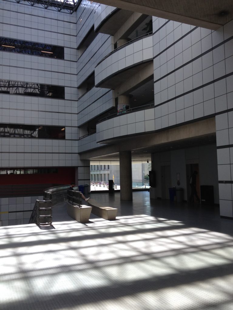
At the old Media Lab Building, built by I.M. Pei in the 1980’s, visitors entering the building first step into a tall 4-story atrium space.  While the atrium has some nice features—skylights from above and resonant acoustics that enhance the music from a grand piano in the lower level, the building wasn’t designed to specifically promote fitness.  One flight of wider stairs lead to a lower level, but the main stairs that could provide exercise for anyone accessing the upper levels are harder to find.

Old MIT Media Lab Atrium / Lobby

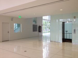
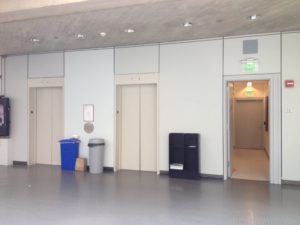
The elevators provide the primary means of accessing the upper floors, while the stairs are strangely tucked into a small back hallway, behind the elevators, next to the bathrooms. 

Old MIT Media Lab Lobby Elevators

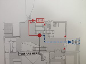
An egress map by the elevators shows the location of this stairway, but does nothing to highlight their existence or promote their use.

Old MIT Media Lab Lobby Plan

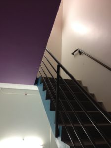
The stairs themselves are a windowless, concrete core stair.  While some new lights and brighter paint colors were recently added, the stairwell is nothing to write home about.  With a direct exit to the outside at the ground floor, it was probably designed more for egress than to encourage physical activity.

Old Media Lab Stairwell

Two Buildings that Promote Fitness:

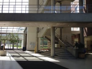
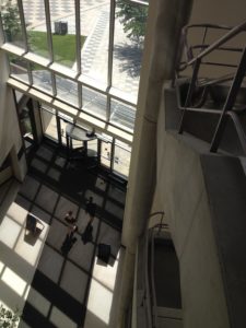
By contrast, at the MIT Health Services Building atrium, a 5-story stair sits next to a heavily-trafficked atrium.  The stairs are visible first, while the elevators are tucked to the side in a secondary hallway.  A number of aesthetic features help encourage people to take the stair:

  • The stair has a fun, triangular shape
  • Multistory glass walls and a skylight make atrium feel bright and airy
  • The is some artwork (and plants) in the atrium
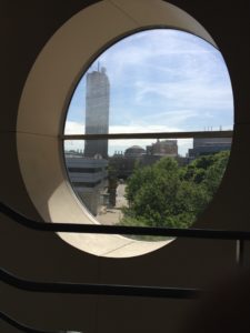
  • Interesting round windows frame views of the outdoors from the upper floors

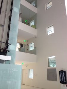
MIT Health Services Building Atrium

MIT Health Services Building Atrium–View from Above

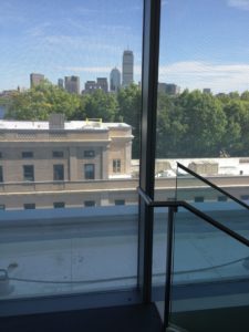
Nice View! MIT Health Services Building Atrium Window

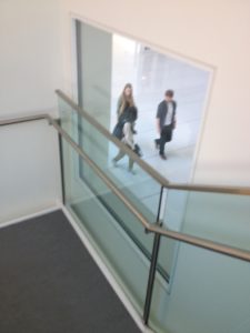
Also, while this is not listed by WELL as an exercise-encouraging aesthetic strategy, the view from the top of the stair of people passing through the atrium is also very nice.

MIT Health Services Building Atrium

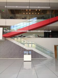
Another example, the new Media Lab Building, designed by Fumihiko Maki and opened in 2010, has two sets of stairs that are clearly visible from either of the two main entrances as required by the WELL Standard.  One long stair, brightly-painted red, blue and yellow at various flights, winds through main atrium. 

New MIT Media Lab Main Stairs

The other is a white core stair next to the main elevators and along an exterior wall.

New MIT Media Lab Main Elevators

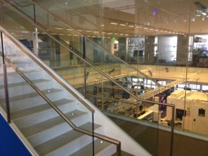
As you walk up the the winding stair you can peer through all-glass walls into some of the labs and see very interesting work (prototype prosthetic limbs from the Biomechatronics group, or robot actors from the Opera of the Future group).

New MIT Media Lab Stairs

Biomechatronics Lab – Of course, I can’t help but think of the Six Million Dollar Man…

The core stair, which runs from the lobby to the 5th floor, sharply contrasts with the darker, concrete stair at the old Media Lab. 

New MIT Media Lab South Stairs

The new stair features a glass exterior wall that provides ample daylight and views of trees, the Charles River and the Boston skyline.

New MIT Media Lab South Stairs

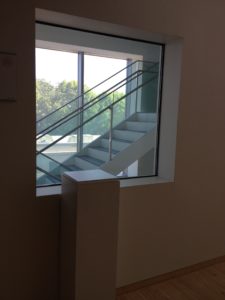
On the interior side wall of stair, small square windows frame views into the building. From the hallway, these windows also promote the stairs; people can also see through to stairwell to the outdoors.

New MIT Media Lab South Stairs

New MIT Media Lab South Stairs

New MIT Media Lab South Stairs

Recommended Improvements:

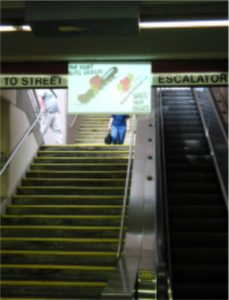
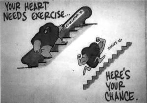
With these three stairs, one easy improvement to further encourage stair use would be to incorporate “point-of-decision prompts”, or what a former colleague of mine, Stephen Intille, calls “just-in-time” information, to encourage stair use.  Intille and one of his former students, Jacob Hyman, installed signs encouraging people to take the stairs instead of the escalator at various subway stops around Boston.  They also built a computer vision system to track how well these signs encouraged exercise.  Hyman’s thesis (Hyman, 2003) reviews previous studies that have shown that signage can increase stair use by around 8%.  Training people to take the stairs seems to last even 2 months after signs are removed.

Jacob Hyman’s Stair Experiment

Jacob Hyman’s Stair Experiment

The lesson: signage encouraging exercise works.  It can also be a inexpensive health-promoting retrofit for existing buildings.

Commentary on the Standard:

If you are studying for the WELL exam, considering real life examples helps solidify the requirements in your mind.

Once you start to apply the WELL Building Standard, however, you realize that satisfying the intent of the standard can be a lot more nuanced than satisfying the letter.  For instance, you could argue that the winding stair of the new Media Lab building satisfies the intent but not necessarily the letter of incorporating art to create visual interest.  The stair itself is quite beautiful with its brushed stainless steel hardware and the small tread lights.

Nice Stair Lights!

Likewise, you could argue that the winding stair provides interesting views that could encourage exercise without specifically providing a “view window”, as listed in the Standard.  The stair runs up an atrium with open views below of a giant video screen, people playing foosball and the occasional a gallery display.  The stair also runs alongside full double height glass walls that display interesting work being done in the labs. 

There’s an option to submit “Alternative Adherence Paths,” so perhaps these details could still count to satisfy the requirements of the Feature.

Visiting the Buildings:

If you find yourself in Cambridge, MA and want to see these buildings in person, take a short walk down Carleton St. from the Kendall/MIT subway stop and pass through the atrium at the MIT Health Services Building (between buildings E25 and E23) and cross the plaza to find the old and new MIT Media Lab Buildings (buildings E15 and E14).  Here’s a map.

And send me a note.  I’d love to connect or hear your thoughts!

Calculations: Mind

Feature 84 Health and Wellness Awareness

  • Part 2: Health and Wellness Library
    • Physical or digital library
        • 1 book or subscription / 20 people, 20 titles max


Feature 86 Post-Occupancy Surveys

  • Threshold for applying feature: applies to buildings with 10 or more employees
  • Survey 30% of occupants every year (minimum)
  • Survey once / year (minimum), except for thermal comfort survey, which is given twice / year: during heating and cooling seasons


Feature 89 Adaptable Spaces

  • Part 1:  Stimuli Management (quiet vs. collaboration spaces):
    • Threshold for applying feature: For spaces 2000 sq. ft. (186 sq. m.) or larger
  • Part 2: Privacy (designated quiet/focus space)
    • Threshold for applying feature: For spaces 20,000 sq. ft. (1860 sq. m.) or larger
    • Minimum space needed: 75 sq. ft. (7 sq. m.) / person
    • Maximum space needed: 800 sq. ft. (74. sq. m), ~ providing for about 10 people
  • Part 3: Space Management (storage)
    • Provide either 1 workstation cabinet or 1 locker (4 cu. ft.) / occupant
  • Part 4: Workplace Sleep Support
    • Provide 1 piece of sleep furniture for:
      • 1st 30 occupants
      • Each additional 100 occupants thereafter


Feature 99 Beauty and Design II

  • Part 1 Ceiling Height
    • Give wider rooms higher ceilings:
      • Room Width: < 30 ft. (9 m):  minimum ceiling height: 8.8 ft. (2.7 m)
      • Room Width: > 30 ft. (9 m):  minimum ceiling height: 9 ft. (2.75 m)
        • Each additional 10 ft. (3 m) room width, add 0.5 ft. (0.15 m) ceiling height
    • Rooms with full wall view of outdoors or atrium can have lower ceilings:
      • Room Width: 40 ft.: minimum ceiling height: 9 ft.
      • Each additional 15 ft. width, add 0.5 ft. height
  • Part 2: Artwork
    • Incorporate artwork in:
      • Entrances and lobbies
      • Regularly occupied spaces > 300 sq. ft. (28 sq. m.)
  • Part 3: Spatial Familiarity
    • Threshold for applying feature: For spaces 10,000 sq. ft. (929 sq. m.) or larger, create a wayfinding/orientation plan


Feature 100 Biophilia II – Quantitative

  • Part 1 Outdoor Biophilia
    • 25% of the project area needs to be landscaped (can be a rooftop garden)
      • 70% of that landscaped area needs to be plantings, including trees
  • Part 2 Indoor Biophilia
    • Floor plants and plant wall on each floor
    • Floor plant requirement:
      • Covers 1% of floor area
    • Plant wall, covering whichever is greater:
      • Area is either 2% of floor area
      • Largest available wall
  • Part 3 Water Feature
    • Threshold for applying feature: Use water features in projects > 100,000 sq. ft. (9290 sq. m.)
    • Use 1 water feature / every 100,000 sq. ft. (9290 sq. m.)

Calculations: Comfort

Feature 73 Ergonomics: Visual and Physical

  • All computer screens should be adjustable (height and distance)
  • 30% of desks should be adjustable (height)
    • Alternative: desktop adjustable stands or pairs of sit and stand desks
  • All seats should be adjustable (height and depth)


Feature 80 Sound Reducing Surfaces

  • Part 1: Ceilings
    • Open offices:  minimum NRC = 0.9 for entire ceiling
    • Conference and teleconference rooms:  minimum NRC = 0.8 for 50% of ceiling
  • Part 2: Walls:
    • For all walls and partitions, need to have minimum NRC = 0.8 for the following areas:
      • Open offices: 25% wall area
      • Private offices, conference and teleconference rooms: 25% wall area
      • Cubicles: Entire partition
        • Also, minimum partition height: 4 ft. (1.2 m)


Feature 82 Individual Thermal Comfort

  • Thresholds for applying feature:
    1. Workspaces over 2150 sq. ft (200 sq. m.), need to:
      • Create a thermal gradient of at least 5 degrees F (3 degrees C)
      • 50% of workspaces are free address (occupants can chose where to work)
    2. More than 10 workstations in the same zone
      • Need to provide personal thermal comfort devices


Feature 83 Radiant Thermal Comfort

  • Part 1: Lobbies and Other Common Public Spaces
    • Satisfy ASHRAE 55-2013 (Thermal Comfort standard) using a radiant (hydronic or electric) system
    • Applies to all lobbies and public spaces
  • Part 2: Offices and Other Regularly Occupied Spaces
    • Satisfy ASHRAE 55-2013 (Thermal Comfort standard) using a radiant (hydronic or electric) system
    • Applies to 50% of offices and regularly-occupied spaces

Calculations: Fitness

Feature 68 Physical Activity Space

  • Threshold for applying feature: Only applies if: organization has more than 10 employees
  • Provide exercise space on site:
    • Minimum size:
      • 200 sq. ft. (18.6 sq. m.)
      • Plus 1 sq. ft. (0.1 sq. m.) additional per occupant
    • Maximum size:
      • 4000 sq. ft. (370 sq. m.)


Feature 69 Active Transportation Support

  • Bike storage requirement: Provide for:
    • 5% of regular occupants:
    • 2.5% of peak visitors
  • Showers:
    • One for 1st 100 occupants
    • One per each 150 additional occupants
  • Lockers:
    • One per every 5 occupants (1/5 of the occupants)
    • Or: show that provided lockers exceed demand by 20%


Feature 70 Fitness Equipment

  • Provide enough cardiorespiratory and muscle-strengthening equipment for 1% of occupants.


Feature 71 Active Furnishings

  • Active workstations:
    • For 3% of employees
  • Standing desks:
    • For 60% of employees

Calculations: Light

Feature 53 Visual Lighting Design

  • Maximum Size of Ambient Lighting Zone:  Whichever is larger:
    • 500 sq. ft. (46.5 sq. m.)
    • 20 % of the space


Feature 54 Circadian Lighting Design

  • If light models/calcs are used, need to provide:
    • Measured in vertical plane, 4 ft. high (seated gaze height)
    • 250 EML (Equivalent Melanopic Lux) minimum
    • 4 hours / day, minimum, every day
    • At 75% of workstations
  • Feature 54 Circadian Lighting Design, Table L1 Melanopic Ratio
    • Equivalent Melanopic Lux (EML) = Visual Lux (L) x Melanopic Ratio (R)


Feature 59 Surface Design

  • Minimum areas of interior surfaces required to have minimum Light Reflectance Values:
    • Ceilings: Min. 80 % area: Min. LRV = 0.8 (80%)
    • Walls: Min. 50% area: Min. LRV = 0.7 (70%)
    • Furnture: Min. 50% area: Min LRV 0.5 (50%)


Feature 61 Right to Light

  • Guidelines for regularly occupied spaces and seats:
    • Spaces: 75% (by area) needs to be within 25 ft. (7.5 m) of a view window
    • Seats:
      • 75% need to be within 25 ft. (7.5 m) of a view window or atrium
      • 95% need to be within 41 ft (12.5 m) or a view window or atrium


Feature 62 Daylight Modeling

  • Minimums:
    • At least 55% of regularly occupied spaces
    • Receive at least 300 lux (28 fc)
    • For at least 50% of the year (business hours)
  • Maximums:
    • No more than 10% of regularly occupied spaces
    • Receive not more than 1000 lux (93 fc)
    • For more than 250 hours / year


Feature 63 Daylighting Fenestration

  • 3 guidelines for window size, shading and placement:
    1. Size:  20% – 60% of exterior wall area should be glazed.
    2. Shading:  If window area is > 40%: prevent glare and heat gain with exterior shading or electrochromic glass.
    3. Daylight effectiveness:  40% to 60% of the window area should be above 7 ft (2.1 m)

Calculations: Nourishment

Feature 38 Fruits and Vegetables

  • Part 1 Fruit and Vegetable Variety
    • Food on site should satisfy either:
      • 2 types of fruits + 2 types of non-fried vegetables
      • 50% of offerings should be fruits or non-fried vegetables


Feature 39 Processed Foods

  • Limits on sugar in food offered on site:
    • Beverages:
      • Max. sugar content per item: 30 g / container
      • 50% of the items must have < 15g / 8 ounce serving
    • Non-beverage foods: Max. sugar content per item: 30 g / serving


Feature 47 Serving Sizes

  • For at least 1/2 of the entrees, offer a smaller, cheaper option that is < 650 calories


Feature 50 Food Storage

  • Cold storage: Provide:
    • 20 L (0.7 cubic feet) / person
    • Max. storage required: 7000 L (247 cubic feet)


Feature 51 Food Production

  • Provide planting space (locate within 1/2 mile (or 0.8 km) of project boundary)
    • 1 sq. ft. (0.1 sq. m.) / person
    • Max. required: 754 sq. ft. (70 sq. m.) total


Feature 52 Mindful Eating

  • Part 1 Eating Spaces (dedicated):
    • Tables and Chairs required: enough for 25% of employees
    • Locate within 200 ft (60m) or 90% of employees